Visual Identity
Logo
Typography
Colors
Photo style
Graphics
Logo
These are the primary logos and should be used at all times unless it is required in black and white by a media agency or supplier.
Primary logo
These are the primary logos and should be used at all times unless it is required in black and white by a media agency or supplier
Secondary logo
These are the secondary logos. They should only be used when the primary logos are not an option.
Example of use: An advert printed in black and white.
Nauta logo
Nauta will be represented with the Nauta logo and the LEMAN group byline as shown.
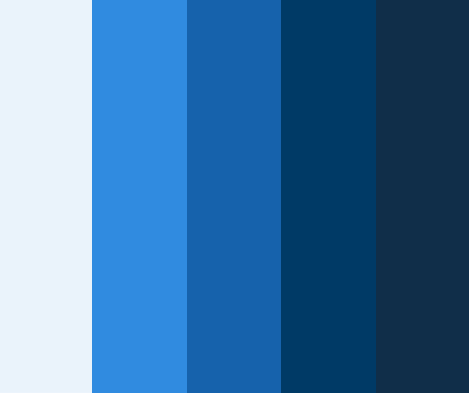
Colors
Primary colour
The primary colour is the essential LEMAN Blue, which should be the most prominent in all communications.
HEX: #00497F
RGB: 0, 73, 127
CMYK: 100, 50, 0, 40
PANTONE: 294 C
RAL: 5010

Secondary colours
As for secondary shades, the support colours can be utilized across all forms of communication.
From left to right
- HEX: #EBF3FB, RGB: 235, 243, 251 CMYK: 7, 1, 0, 0
- HEX: #308BE0, RGB: 48, 139, 224 CMYK: 86, 35, 0, 0
- HEX: #1463AC, RGB: 235, 243, 251 CMYK: 100, 61, 4, 0
- HEX: #003A66, RGB: 0, 58, 102 CMYK: 100, 79, 34, 26
- HEX: #102E49, RGB: 16, 46, 73 CMYK: 100, 80, 42, 47
Web & Presentation Support colours
The web and presentation support colors will primarily serve as backgrounds or underlying layers for text or image overlays.
Although the logo features a significant red color, it is only used as a focus indicator on the web: for buttons, call-to-action elements, and icons.
From left to right
- HEX: F6F5F2, RGB: 246, 245, 242 CMYK: 2, 2, 3, 0
- HEX: EBE6E0, RGB: 235, 230, 224 CMYK: 6, 7, 9, 0
- HEX: DEDEDE, RGB: 222, 222, 222 CMYK: 11, 8, 9, 0
- HEX: 787980, RGB: 120, 121, 128 CMYK: 56, 46, 40, 8
- HEX: E30613, RGB: 227, 6, 19 CMYK: 0, 98, 97, 0 RAL: 3002

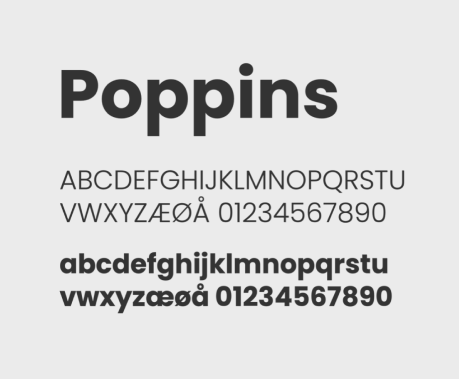
Typography
The Poppins font is a modern and versatile typeface based on geometric shapes like circles and squares which contribute to its readability and friendly appearance. It comes in a range of weights, from Thin to Black, making it versatile and suitable for various design applications.
Primary Communication & body copy
We use this as the heading type as well as body copy for all our communication across all media. From ads to PowerPoints presentations.
The black weight will be used for all headings (the only exception is on our webpage, where we have a section with regular as a heading due to variation). Regular is used for body copy, alternatively light for an even lighter expression.
Fallback for office use
Verdana is used in Microsoft Office, Mail, Outlook and Word. Verdana is pre-installed in most systems and therefore appears the same in various mail programs and word documents that are sent across mac/pc etc.
The font is license-free.
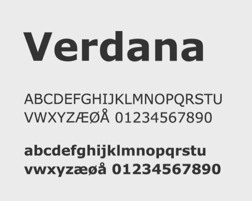
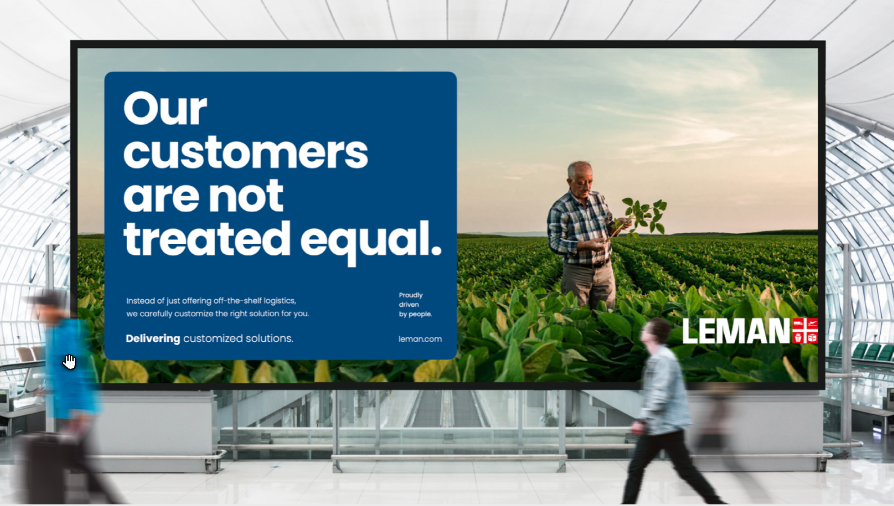
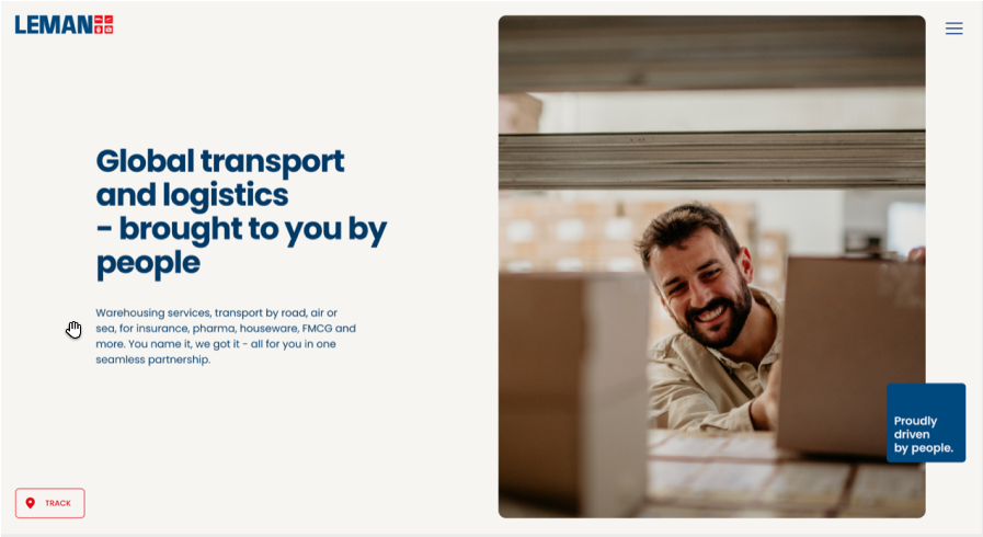
Photo style
This LEMAN image style of primarily people in work situations is highly engaging, evoking a sense of human connection, professionalism, and authenticity. It helps to make the brand visually appealing while effectively conveying the importance and diversity of work scenarios.
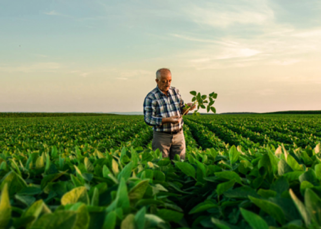
Authenticity
The images show colleagues and customers in their real work environment. Locations and tasks are realistic and plausible. The workplace is real, the models are trustworthy and their interactions are authentic.
People
The primary characteristic of our image style is a tight framing of the subjects. Each image will focus on the person portrayed, capturing expressions, details, and emotions.
Encourage the subjects to not make eye contact with the viewer. This establishes a sense of realism and authenticity.
Showcasing a diverse range of people from various backgrounds, professions, race and age groups will reflect inclusivity and diversity in the workplace.


Contrast and depth
High contrasts and hard shadows are essential for the expressive and sharp image that LEMAN stands for. The motif shows a sharp range of details in the foreground or background. Likewise, there is unsharpness in the foreground or background.
Natural lighting
The images should be lit with natural light or soft, diffused artificial light. This approach ensures that the subjects appear approachable, relatable, and their facial expressions are clearly visible without harsh shadows.

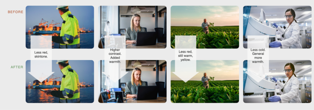
General look & feel
The images are generally toned warm, with yellow – Pay attention to red tones that easily override skin tones. Generally high contrast without being overwhelming.
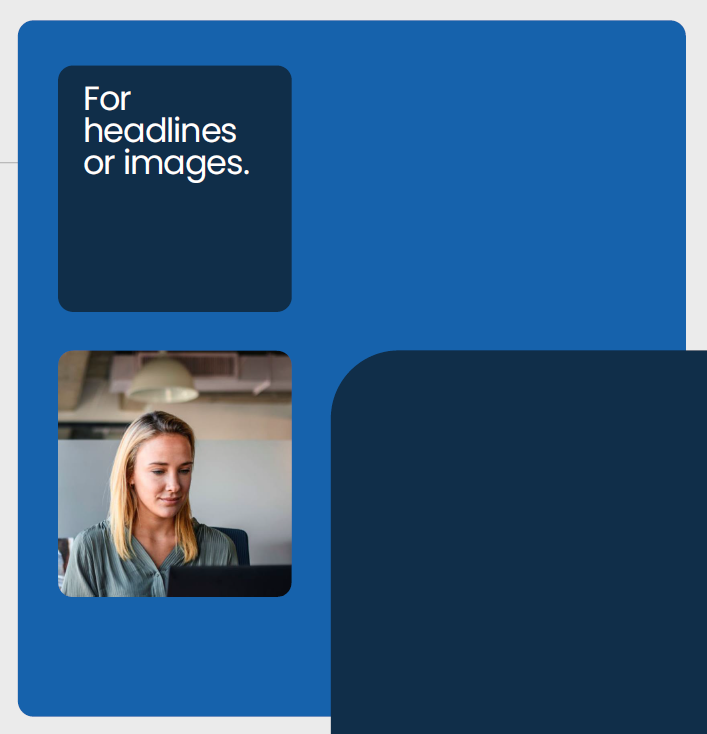
Graphics
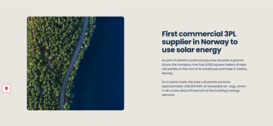
In order to provide a consistent style across elements and media, we use the graphic box element with rounded corners for text boxes, image fields, etc. The soft corners represent our modern people approach to the market.
Graphic box
In order to provide a consistent style across elements and media, we use the graphic box element with rounded corners for text boxes, image fields, etc. The soft corners represent our modern people approach to the market.
Icons
The icons are designed with clean, simple strokes, making them ideal for digital use, even at small sizes. They are primarily intended for use on websites and other digital platforms, but can also be easily adapted for offline materials if desired.
Examples